How I built a digital solution for medicine delivery using agile methodologies and UX design.
tags
App
covid 19
hackathon
used tools
figma
html and css
FCamara is a technology company in São Paulo. Every six months they opened a selection process to hire technology and design professionals, a process that aimed to know the candidates, understand their limitations and abilities.
The aim of the hackathon was to develop a solution using the design and UX methodology. In this version, the focus of the project was to help people during the Covid-19 crisis with some problem existing at the time.
Discovery
Search and target audience
Page in the notion of the search done in the discovery stage.
Following the design thinking methodology, in short, my first action was to talk to the team and identify the challenge we wanted to face, define what our possible target audience would be to continue to research and create personas.
The complete search and all the information collected can be seen clicking here.
qualitative research
I used a qualitative questionnaire to understand the problems of the target audience, sketch a portrait of users, collect data and understand difficulties and business possibilities.
Two types of questionnaires were carried out: one for end users and another for drug companies/stores.
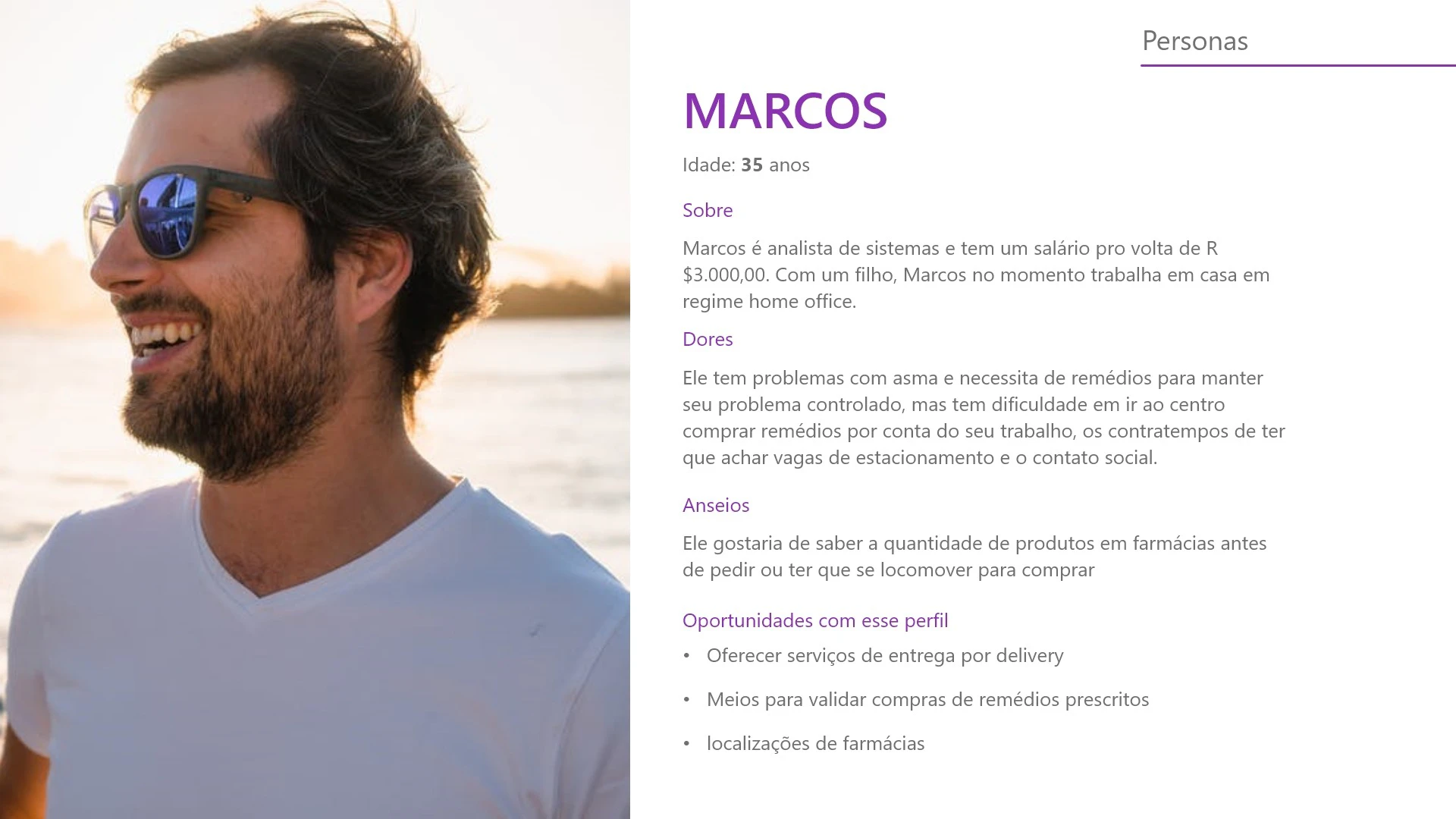
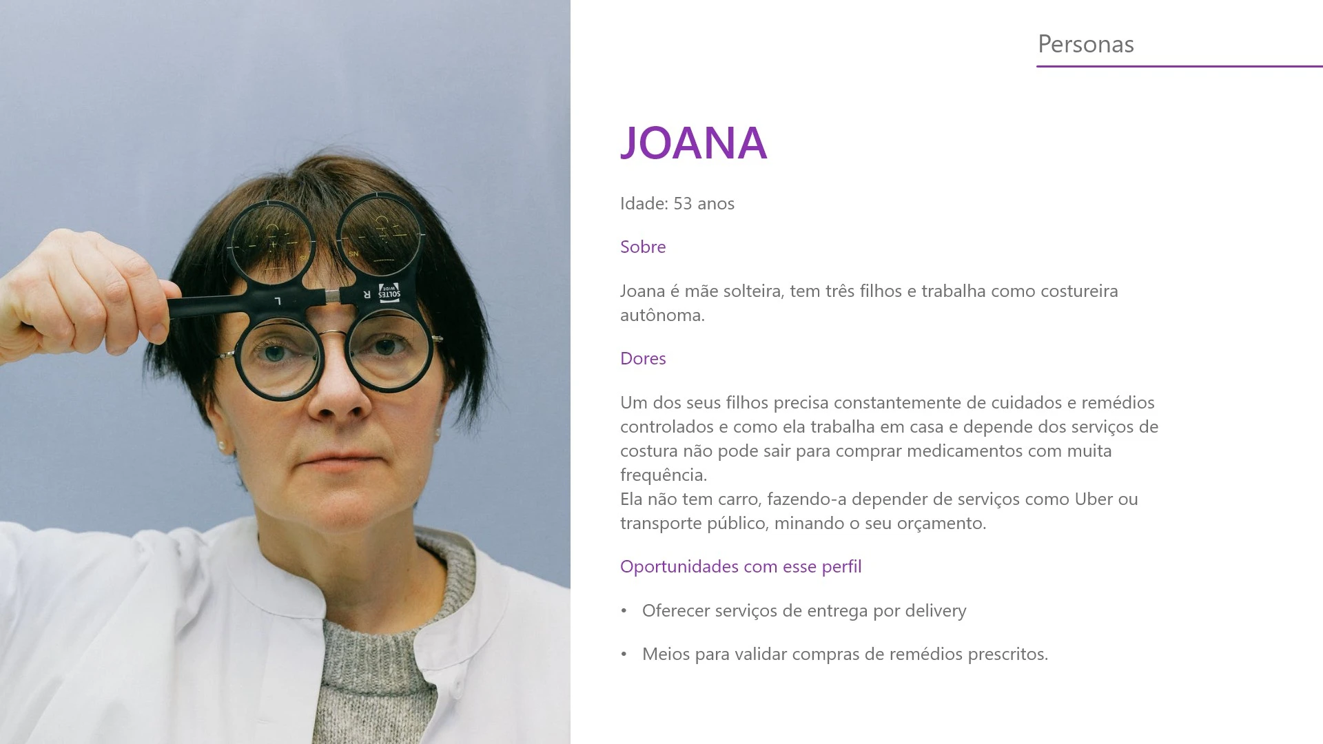
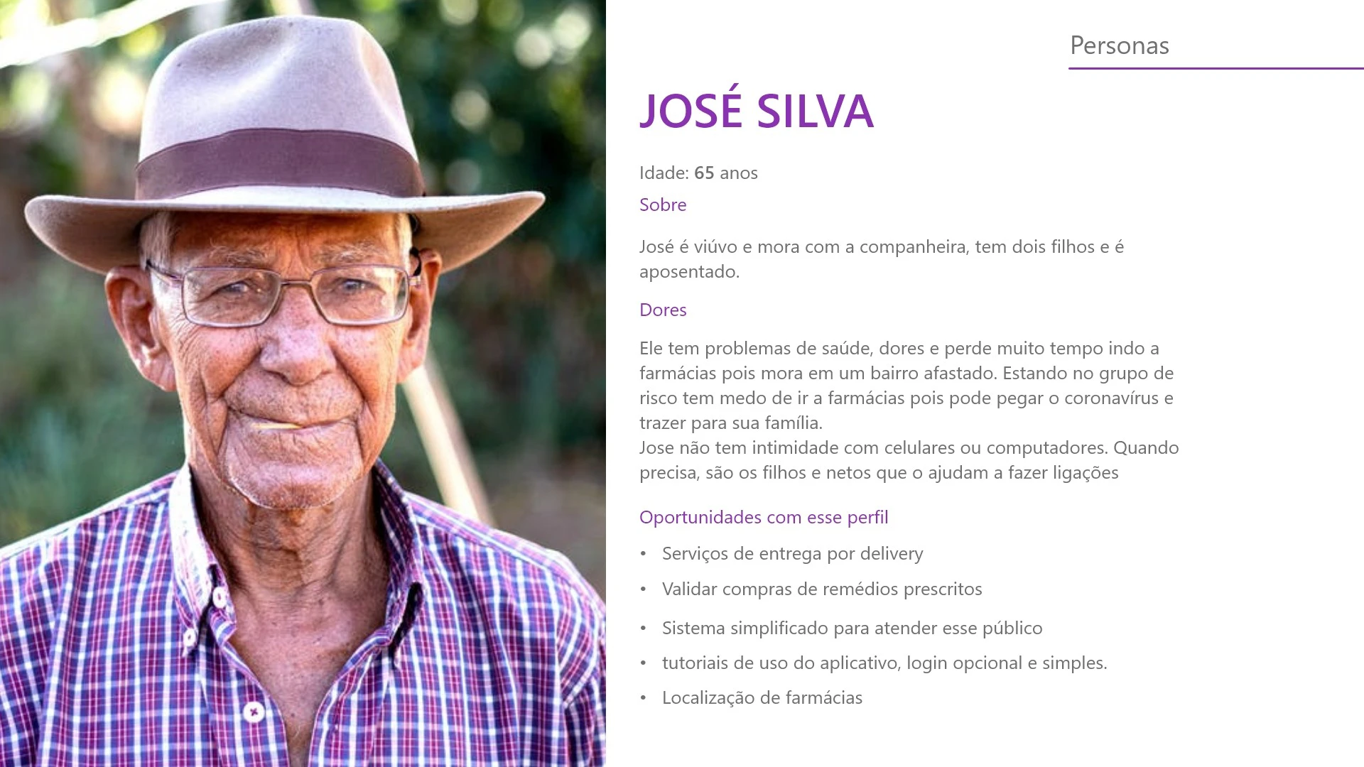
After collecting data from the questionnaires we sent, I was able to work on building personas and the profile of our audience.
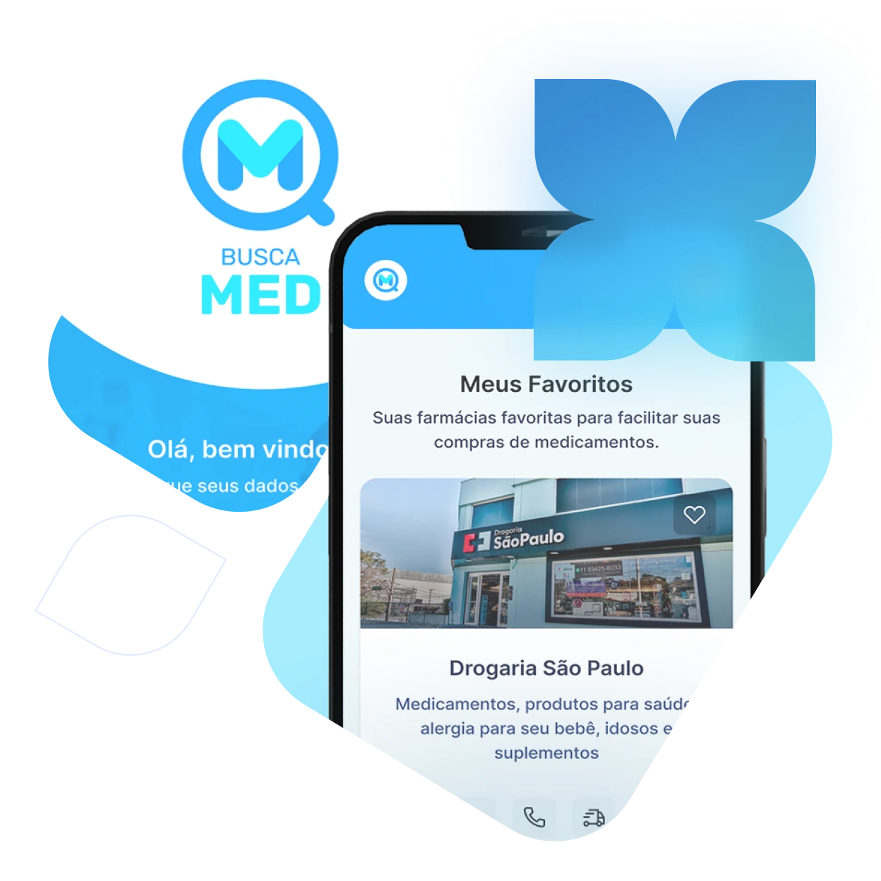
The target audience was defined and what challenge we would try to solve, in this case, a solution for ordering and delivering medicines with some differentials for people in the risk groups.
Benchmark
With the personas created, I did a reference survey, studying various delivery and drug applications to understand what the best practices were and what errors existed.
UX/UI Design
Wireframe, style guide and prototyping
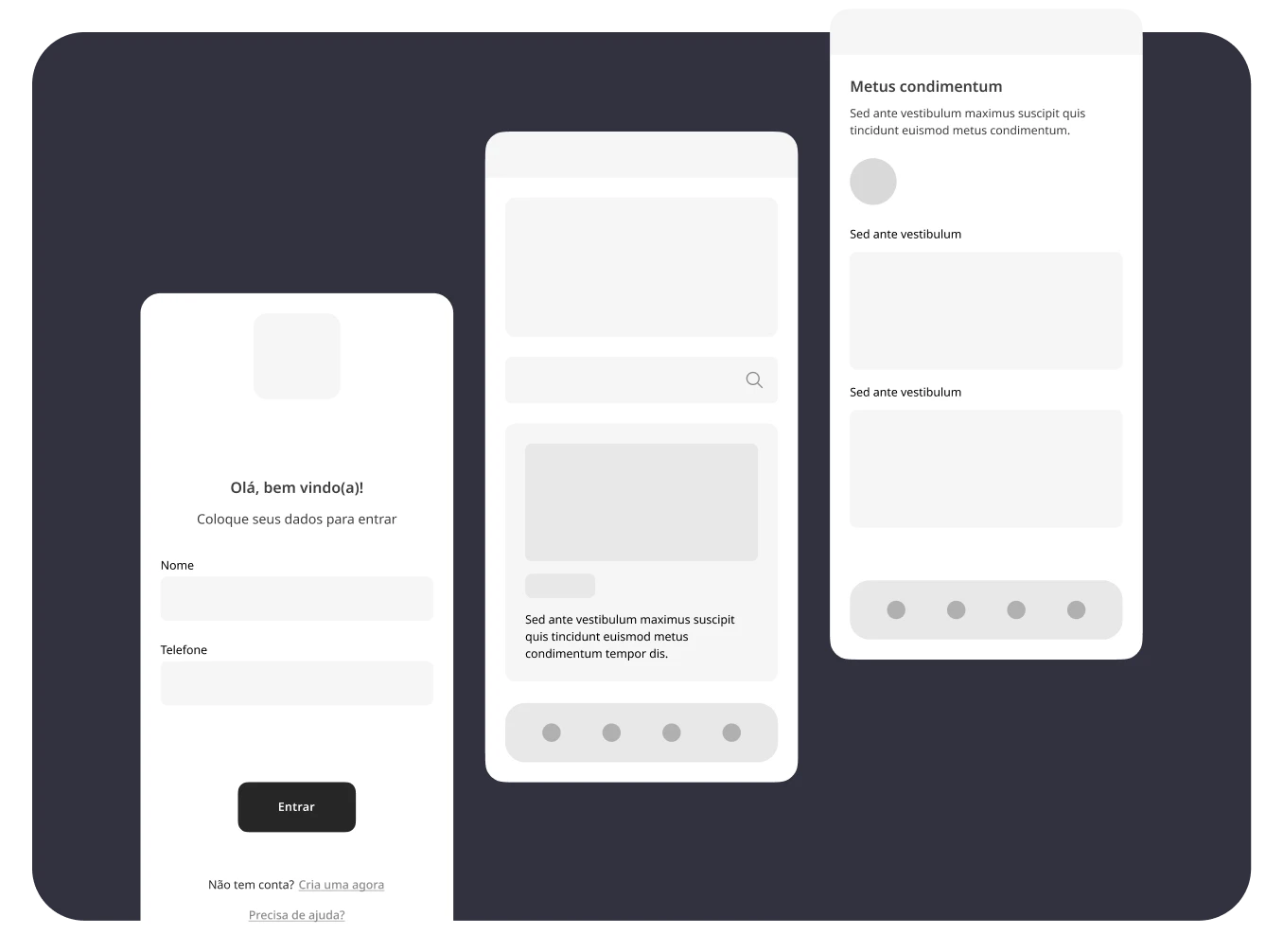
Screen wireframes
wireframes
I used all the reference search to define the structure of our solution, as well as the flow of the user journey until it fulfills its objectives in the application.
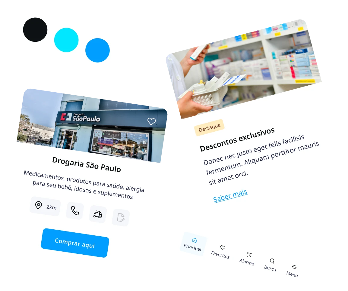
Style Guide
In parallel with the structure, I developed the style guide for our application, defining colors and typography based on market research, maintaining a certain visual pattern already recognized by users of applications of the same type.
Many points of this project changed as I evolved as a professional, including the design itself and the figma file that was improved. I took on new ways to work and organize the elements within my projects.
I left here some of the first versions of the design of the screens, as well as the evolution over time. Pretty cool, huh? 😉
All design steps were completed and the journey was handed over to the Squad member for development.
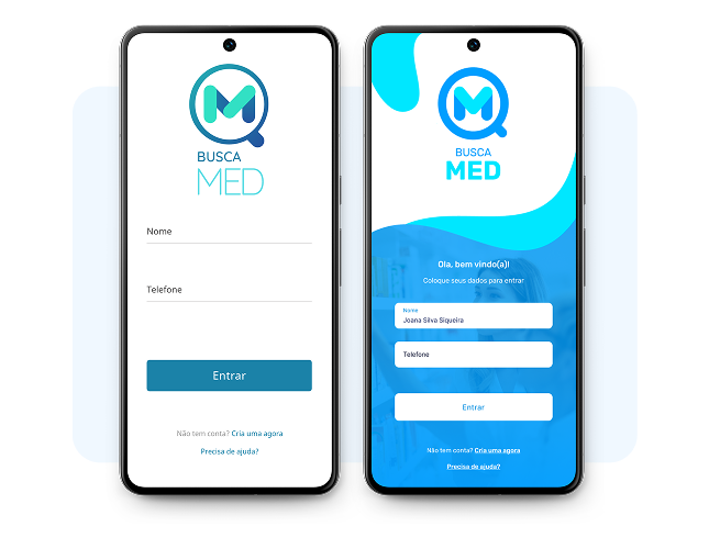
It was not possible to develop a functional MVP, however, in order not to be without something tangible, I encoded the application’s login screen in HTML and CSS.
The code is available on my github. The link is at the end of this page.
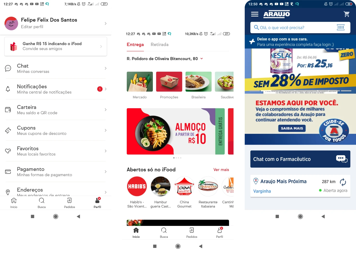
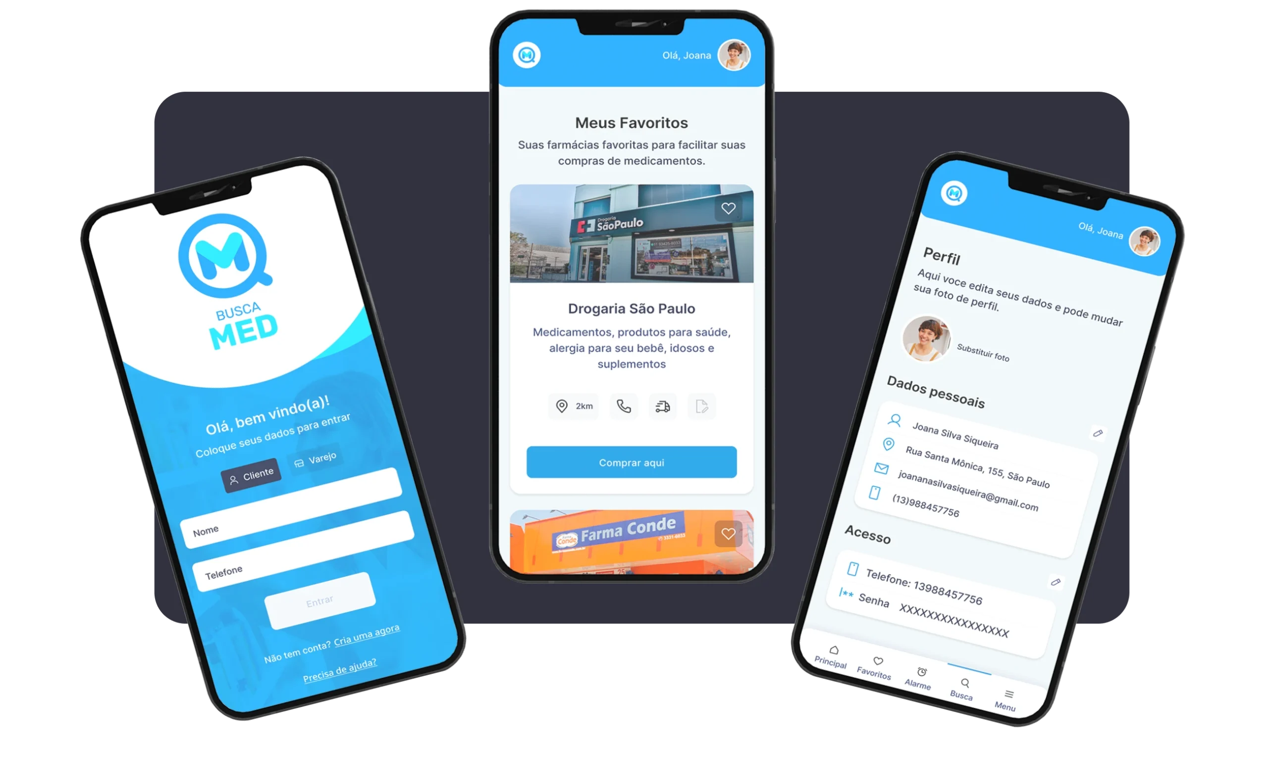
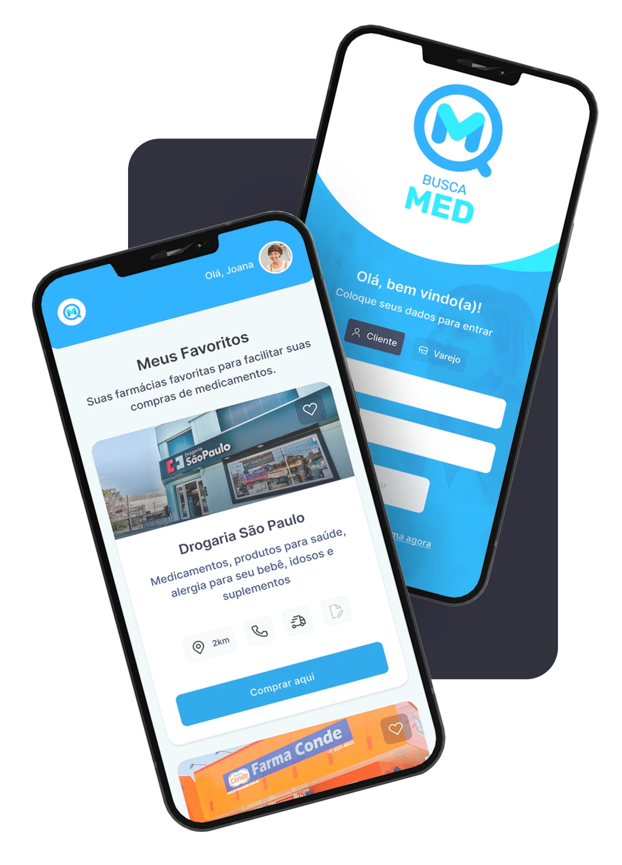
Images of some main project screens
add your heading text here
Prototype and code
Check out the navigable prototype in Figma and the login screen code on my GitHub through the links below.