Buscamed
How I built a digital solution for medication ordering and delivery during the COVID-19 pandemic.
Tags
App design
COVID 19
Hackathon
Ferramentas usadas
- Figma
- HTML and CSS
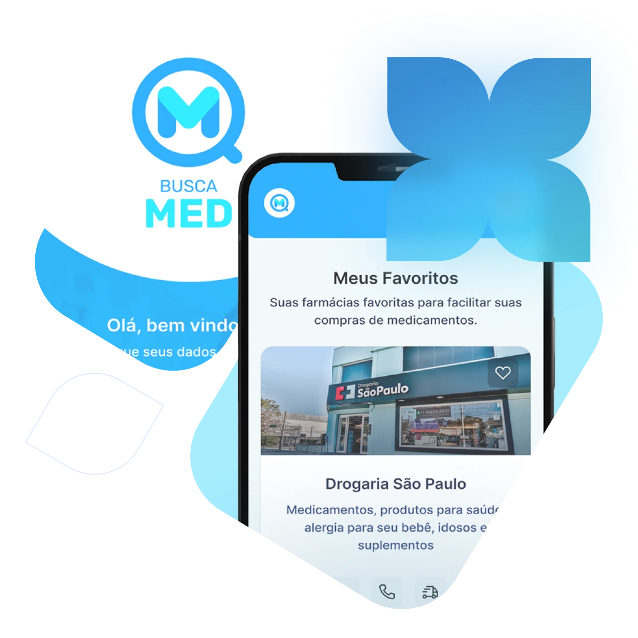
Fcamara is a technology company based in São Paulo. Every six months, they launched a selective process to hire technology and design professionals. This process was designed to get to know the candidates, understanding both their limitations and their capabilities.
The hackathon challenged us to develop a solution using design and UX principles. The project specifically aimed to solve a relevant problem that emerged for people during the COVID-19 crisis.

- Discovey
User Research and Segmentation

Adopting a Design Thinking approach, my initial step was to identify the problem space with the team and define the target audience, setting the stage for subsequent user research and the creation of user personas.
In-Depth Qualitative Analysis
My research involved a qualitative questionnaire to identify user problems, draft user profiles, gather insights, and evaluate both friction points and areas for business growth.
The research involved two segmented questionnaires: one dedicated to consumers and the other focused on medical supply businesses.
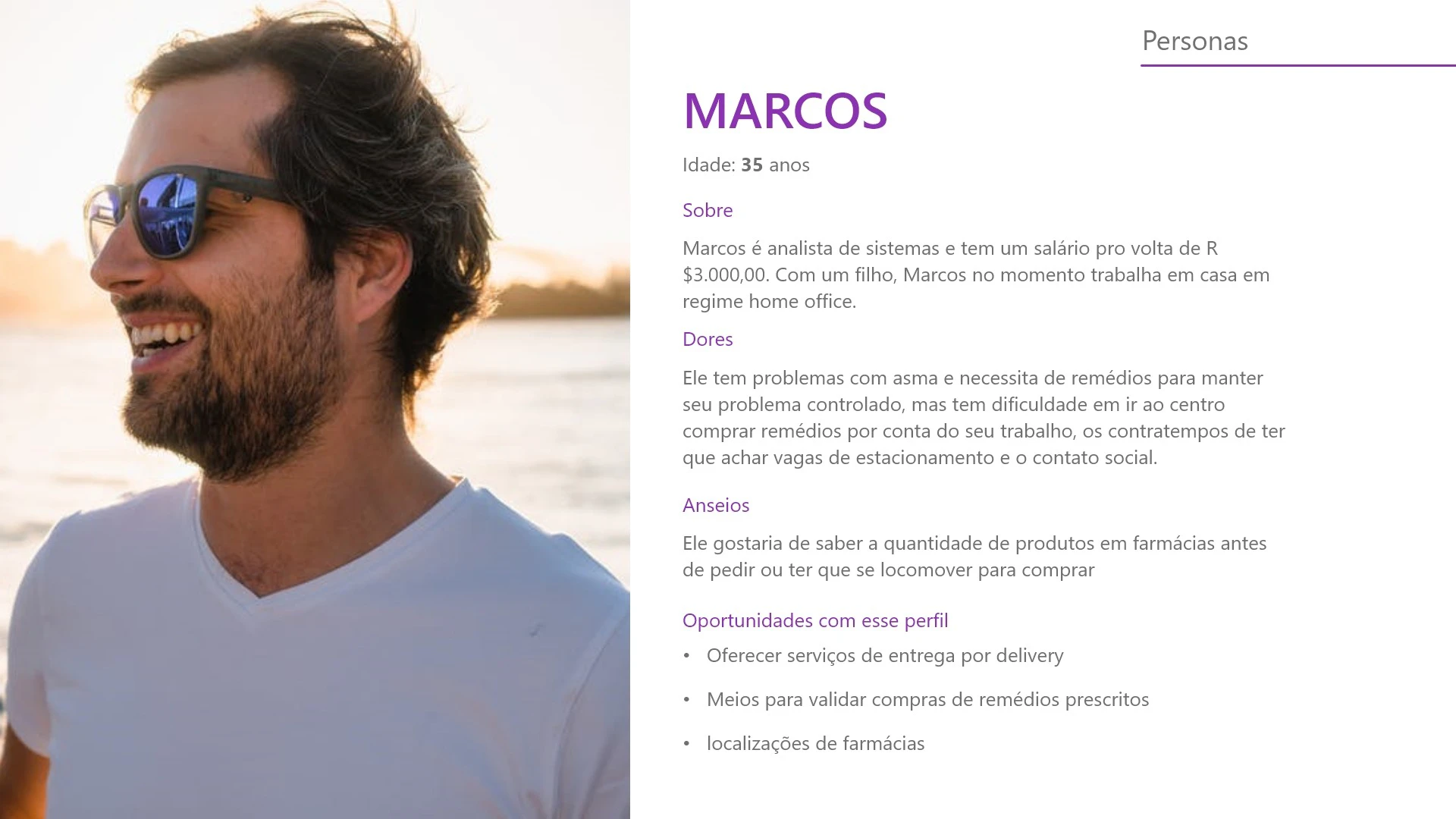
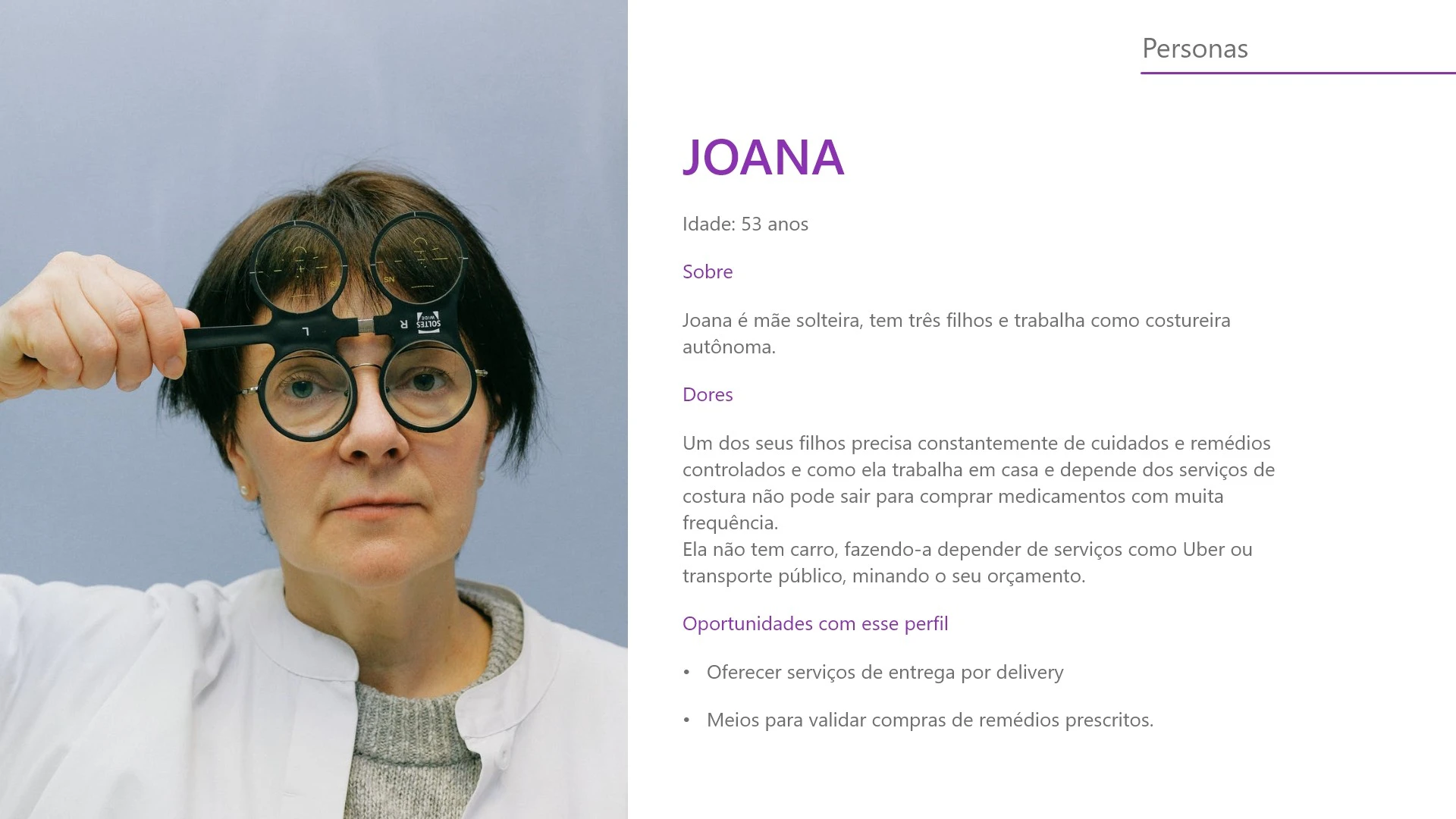
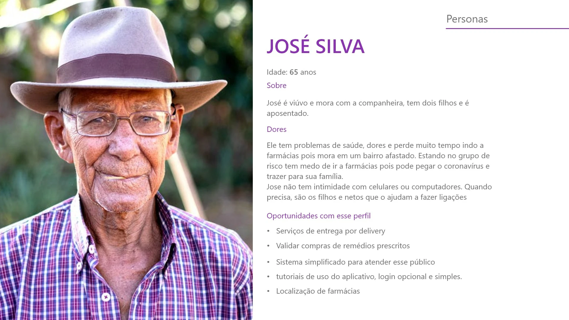
Personas
With the questionnaire data collected, I moved on to developing user personas and establishing the profile of our target audience.
With the target audience established, we focused on solving a single challenge: developing a unique medication ordering and delivery service tailored for vulnerable populations.
Market Research and Best Practices
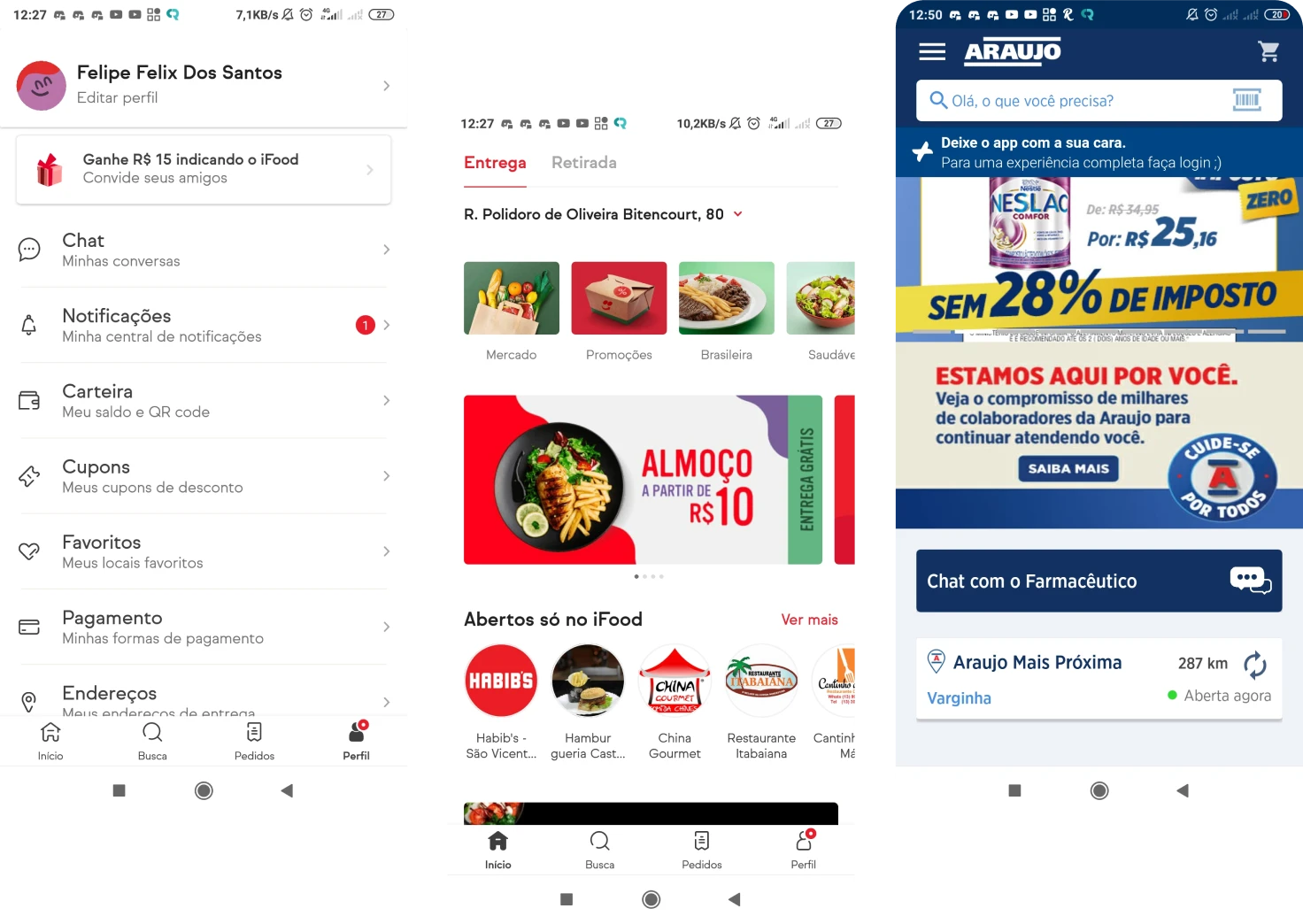
With the user personas established, I conducted a competitive analysis, studying various delivery and medicine apps to understand the best practices and identify existing flaws.
- UX/UI Design
Wireframing, Style Guide and Prototyping
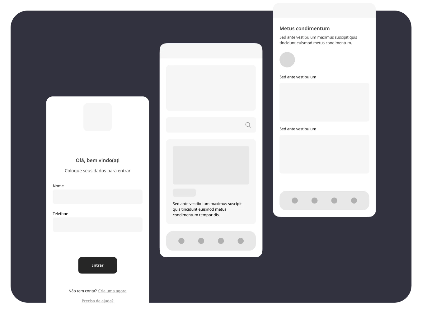
The findings from the reference study guided the definition of the solution’s structural framework and the user journey required to meet their objectives in the application.
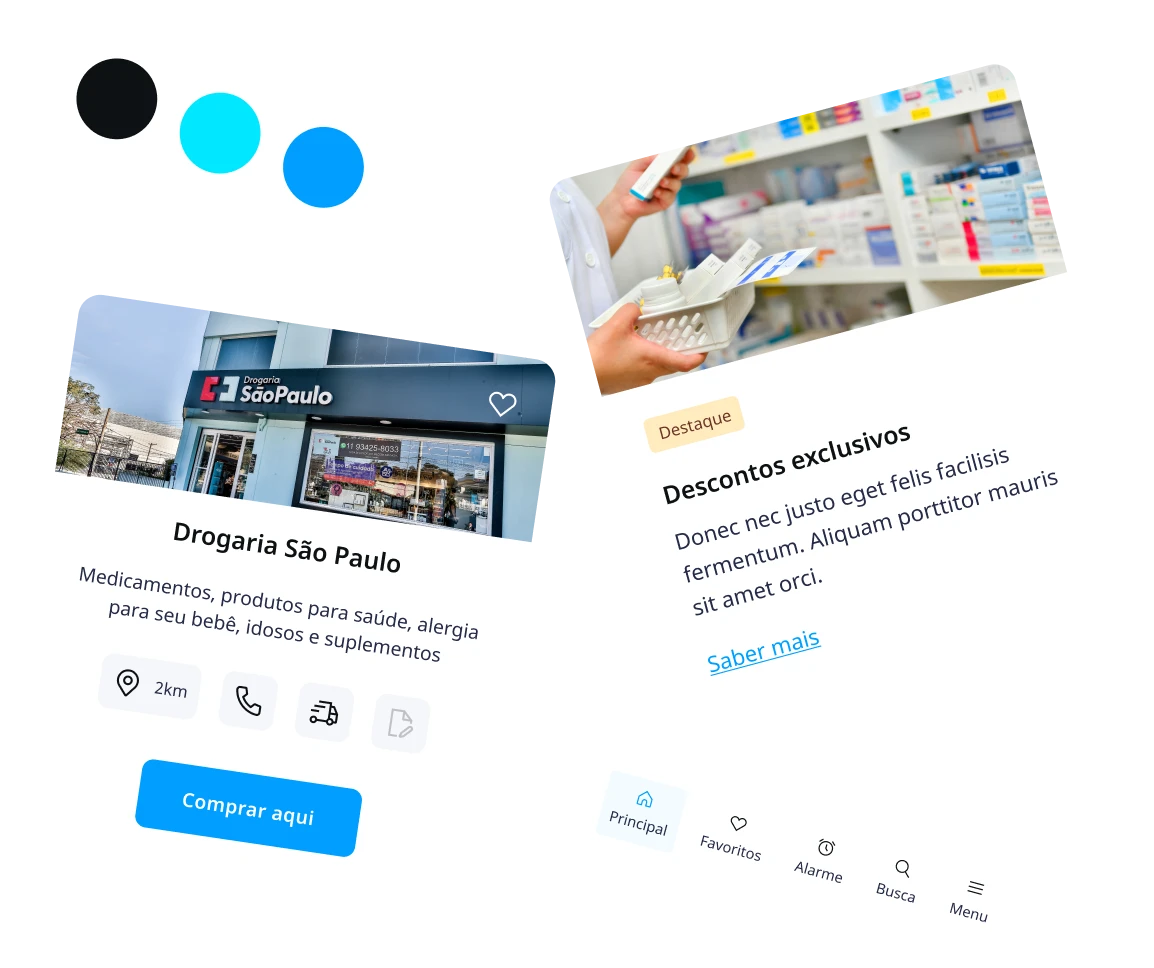
Style Guide
Alongside the wireframing process, I defined the app’s style guide. Colors and fonts were chosen based on market studies, ensuring visual consistency with established competitors.
Timeline and Progress
As my expertise matured, I continuously updated this project, improving the overall design and enhancing the organization of the Figma file. I integrated optimized methods for element management in all my design work.
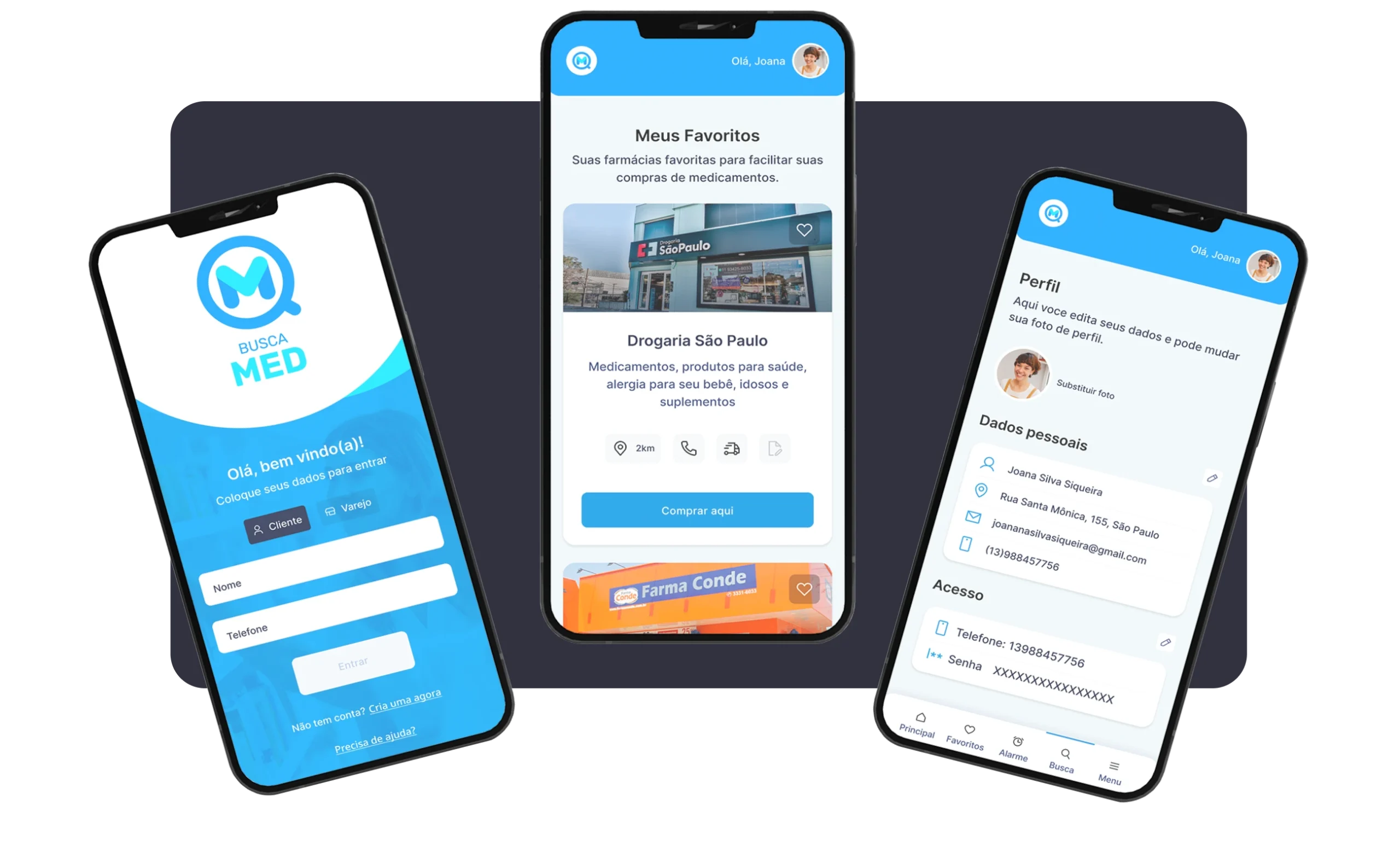
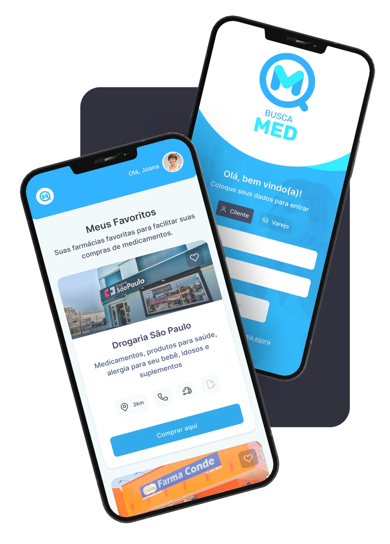
Here are some of the initial design screen versions, alongside their evolution over time. Pretty cool, right? 😉
- Deliveries
Project Evaluation and Feedback
The entire design workflow was finalized, and the user journey was transitioned to the Development Squad for engineering.
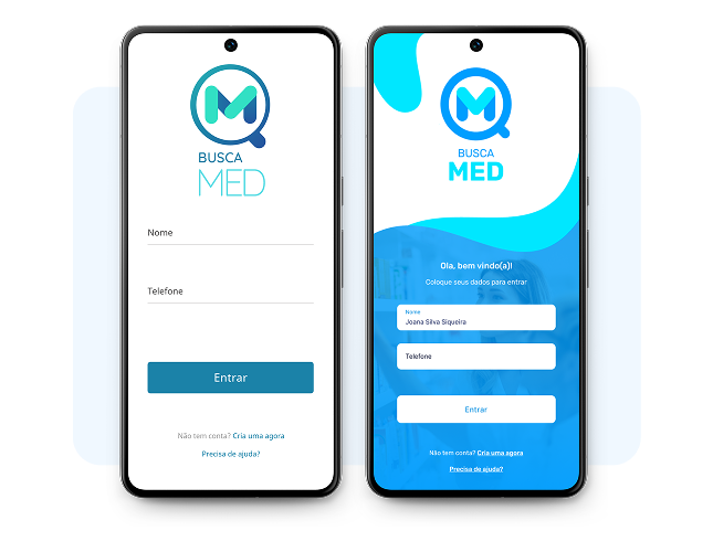
While a working MVP was not feasible, I took the initiative to code the application’s login screen in HTML and CSS, providing a concrete example of the final product.
You can view the code on my GitHub repository. The link is located at the end of this page.
Add Your Heading Text Here
Prototype and Code
Check out the navigable Figma prototype and the login screen code on my GitHub using the links below.


